# Load necessary libraries
library(ggplot2)
library(plotly) # For interactive 3D plotting
library(caret)  # For PCA and regression
library(GGally) # For ggpairs
library(ggfortify)

set.seed(123) # Ensuring our pretend data is the same each time

# Generate our dataset
n <- 300 # Number of observations
X1 <- rnorm(n, mean = 50, sd = 10)
X2 <- X1 + rnorm(n, mean = 0, sd = 25) # More noise added
X3 <- X1 + rnorm(n, mean = 0, sd = 10) # More noise added
y <- X1 + X2 + X3 + rnorm(n, mean = 0, sd = 30) # Increase noise in the dependent variable

data <- data.frame(X1, X2, X3, y)Does it Spark Joy? Using PCA for Dimensionality Reduction in R
PCA
Principal Component Analysis (PCA) is a powerful tool for dimensionality reduction. In this post, we provide an overview of PCA, explaining its purpose and how it works. We then walk through a hands-on application of PCA using R, demonstrating the step-by-step process of PCA and its application in predictive modeling.
Understanding Principal Component Analysis (PCA)
Principal Component Analysis (PCA) simplifies the complexity in high-dimensional data by transforming it into a new set of variables, called principal components, which capture the most significant information in the data.
The remainder of this post is organized as follows:
How it Works: We provide an overview of PCA mathematically, explaining its purpose and how it works.
Applied Example: Navigating PCA and Predictive Modeling with R: We walk through a hands-on application of PCA using R, demonstrating the step-by-step process of PCA and its application in predictive modeling.
How it Works
Step 1: Standardization
Suppose we have a dataset with \(n\) observations and \(p\) variables.
\[ X = \begin{bmatrix} x_{11} & x_{12} & \cdots & x_{1p} \\ x_{21} & x_{22} & \cdots & x_{2p} \\ \vdots & \vdots & \ddots & \vdots \\ x_{n1} & x_{n2} & \cdots & x_{np} \end{bmatrix} \]
First, we standardize the data matrix \(X\) to have a mean of 0 and a standard deviation of 1 for each variable. This is crucial for ensuring that all variables contribute equally to the analysis.
Given a data matrix \(X\), the standardized value \(z_{ij}\) of each element is calculated as:
\[ z_{ij} = \frac{x_{ij} - \mu_j}{\sigma_j} \]
where \(\mu_j\) is the mean and \(\sigma_j\) is the standard deviation of the \(j^{th}\) column of \(X\).
Step 2: Covariance Matrix
Next, we calculate the covariance matrix \(C\) from the standardized data matrix \(Z\). The covariance matrix reflects how variables in the dataset vary together.
The covariance matrix is calculated as:
\[ C = \frac{1}{n-1} Z^T Z \]
where \(Z\) is the standardized data matrix, and \(n\) is the number of observations.
Step 3: Eigenvalue Decomposition
The eigenvalue decomposition of the covariance matrix \(C\) is performed next. This step identifies the principal components of the dataset.
For the covariance matrix \(C\), we find the eigenvalues \(\lambda\) and the corresponding eigenvectors \(v\) by solving:
\[ Cv = \lambda v \]
Step 4: Selection of Principal Components
The principal components are selected based on the eigenvalues. The eigenvectors, corresponding to the largest eigenvalues, represent the directions of maximum variance in the data.
By selecting the top \(k\) principal components, we reduce the dimensionality of our data while retaining most of its variability.
Summary
PCA transforms the original data into a set of linearly uncorrelated variables, the principal components, ordered by the amount of variance they capture. This process allows for the simplification of data, making it easier to explore and visualize.
Applied Example: Navigating PCA and Predictive Modeling with R
In this segment, we dive into a hands-on application of Principal Component Analysis (PCA) using R, aimed at simplifying and demystifying the process through a simulated dataset. Our approach mirrors the methodical steps of a college textbook, focusing on clarity, precision, and practical insights.
Generating a Simulated Dataset
First, let’s create a dataset that reflects the complexity often encountered in real data. Our simulated dataset includes:
We simulate 300 observations, ensuring a robust dataset for analysis.
Variables \(X1\), \(X2\), and \(X3\) are created with varying degrees of noise, simulating real-world unpredictability. \(X2\) and \(X3\) are intentionally correlated with \(X1\) but with their unique twists of randomness.
Our outcome variable y is a concoction of influences from \(X1\), \(X2\), and \(X3\), topped with its own layer of noise.
Here’s the R code to generate this dataset:
Visualizing the Data
Before applying PCA, we visually explore the dataset to understand the relationships between variables. ggpairs provides a comprehensive pairwise comparison, offering initial insights into correlations and variability among our predictors and with the outcome variable.
# Let's peek at the relationships
ggpairs(data)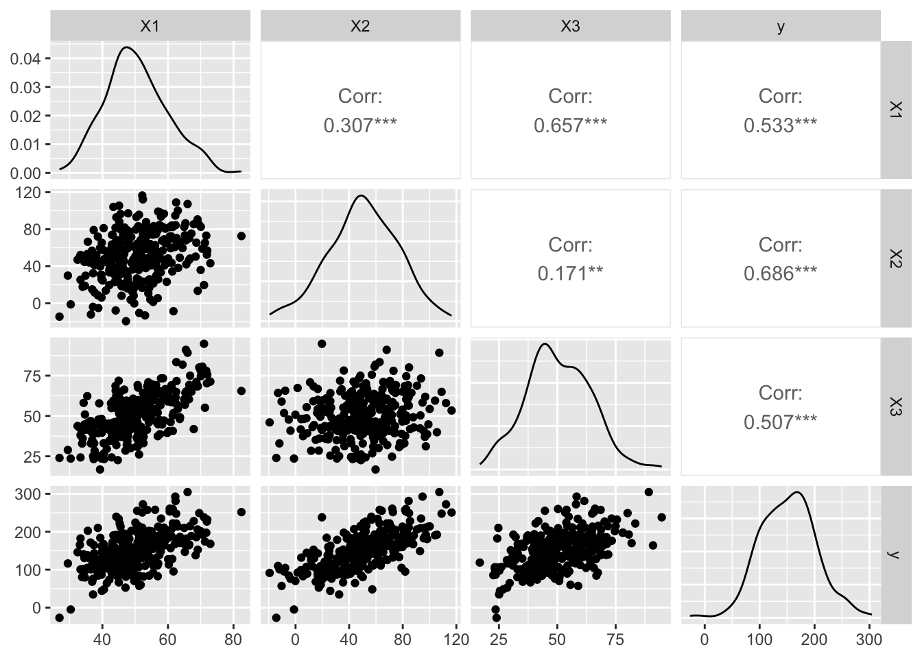
3D Visualization
A 3D scatter plot further elucidates the interactions among predictors, allowing us to appreciate the dataset’s complexity beyond 2D limitations..
# Interactive 3D plot to visualize relationships
fig <- plot_ly(data, x = ~X1, y = ~X2, z = ~X3, type = 'scatter3d', mode = 'markers',
               marker = list(size = 5, opacity = 0.5))
fig <- fig %>% layout(scene = list(xaxis = list(title = 'X1'),
                                   yaxis = list(title = 'X2'),
                                   zaxis = list(title = 'X3')))
fig
Isn’t that cool? Visualizing data in 3D can offer insights that are not immediately obvious in 2D plots, providing a richer understanding of our dataset’s structure.
Simplifying Complexity with PCA
With PCA, we aim to reduce the dataset’s dimensionality by identifying principal components that capture the most variance. This step simplifies the dataset, making subsequent analyses more manageable.
# Perform PCA
pca_result <- prcomp(data[,1:3], center = TRUE, scale. = TRUE)

# Let's see the summary of our PCA to understand the variance explained
summary(pca_result)
Importance of components:
PC1 PC2 PC3
Standard deviation 1.3418 0.9338 0.5723
Proportion of Variance 0.6002 0.2907 0.1092
Cumulative Proportion 0.6002 0.8908 1.0000# And visualize the PCA
autoplot(pca_result, data = data, colour = 'y', frame = TRUE, frame.type = 'norm')
The summary and plot from PCA show us how much of the total variance is captured by each principal component. This step is crucial as it guides us in deciding how many components to retain for our predictive modeling.
Predictive Modeling: Principal Component Regression (PCR)
In this section, we demonstrate the application of Principal Component Regression (PCR), a method that leverages dimensionality reduction through PCA for predictive modeling. The process involves training a regression model on a simplified version of the training data, where simplification is achieved by reducing the data’s dimensions using PCA.
Process Overview
Split the Data: We begin by dividing our dataset into training and testing sets to prepare for a robust evaluation of the model’s predictive performance.
Apply PCA to the Training Data: PCA is performed on the training data to identify the principal components, which are the directions in the data that account for the most variance.
Transform Both Training and Testing Data: The principal components obtained from the training data are then used to transform both the training and testing sets into the PCA space. This ensures that the model is trained and evaluated on data represented in the same reduced-dimensionality space.
Train the Model on Transformed Training Data: A regression model is trained using the PCA-transformed training data. This model aims to predict the outcome variable based on the reduced set of features (principal components).
Evaluate the Model on Transformed Testing Data: The model’s predictive performance is assessed using the PCA-transformed testing data, allowing us to understand how well the model generalizes to new, unseen data.
# Splitting the dataset
trainingIndex <- createDataPartition(data$y, p = .8, list = FALSE)
trainingData <- data[trainingIndex, ]
testingData <- data[-trainingIndex, ]

# Performing PCA on training data
pca_train <- prcomp(trainingData[,1:3], center = TRUE, scale. = TRUE)

# Transforming both training and testing data using the PCA model first 2 comps
trainingData_transformed <- predict(pca_train, newdata = trainingData[,1:3])[,1:2]
testingData_transformed <- predict(pca_train, newdata = testingData[,1:3])[,1:2]

# Preparing data for modeling
trainingModelData <- as.data.frame(trainingData_transformed)
trainingModelData$y <- trainingData$y

# Fitting the linear model on transformed training data
model <- lm(y ~ ., data = trainingModelData)

# Summary of the model trained on PCA-transformed training data
summary(model)
Call:
lm(formula = y ~ ., data = trainingModelData)

Residuals:
    Min      1Q  Median      3Q     Max
-78.422 -24.126  -1.018  17.075  90.479

Coefficients:
            Estimate Std. Error t value Pr(>|t|)
(Intercept)  151.971      2.024  75.098   <2e-16 ***
PC1           27.096      1.510  17.940   <2e-16 ***
PC2           20.172      2.165   9.319   <2e-16 ***
---
Signif. codes:  0 '***' 0.001 '**' 0.01 '*' 0.05 '.' 0.1 ' ' 1

Residual standard error: 31.35 on 237 degrees of freedom
Multiple R-squared:  0.633, Adjusted R-squared:  0.6299
F-statistic: 204.3 on 2 and 237 DF,  p-value: < 2.2e-16
# Predicting and calculating RMSE on transformed testing data
predictions <- predict(model, newdata = as.data.frame(testingData_transformed))
rmse <- sqrt(mean((predictions - testingData$y)^2))
print(paste("RMSE:", rmse))[1] "RMSE: 29.7476744937811"Comparing with Traditional Regression
We contrast PCR’s performance with a traditional regression model using all predictors. This comparison assesses whether PCA’s dimensionality reduction impacts predictive accuracy.
# Traditional linear regression model
full_model <- lm(y ~ X1 + X2 + X3, data = trainingData)
summary(full_model)
Call:
lm(formula = y ~ X1 + X2 + X3, data = trainingData)

Residuals:
    Min      1Q  Median      3Q     Max
-77.406 -21.676  -0.272  17.163  92.270

Coefficients:
            Estimate Std. Error t value Pr(>|t|)
(Intercept) -6.59698   10.85595  -0.608   0.5440
X1           0.89290    0.29335   3.044   0.0026 **
X2           1.17467    0.08144  14.423  < 2e-16 ***
X3           1.09015    0.19330   5.640 4.85e-08 ***
---
Signif. codes:  0 '***' 0.001 '**' 0.01 '*' 0.05 '.' 0.1 ' ' 1

Residual standard error: 30.95 on 236 degrees of freedom
Multiple R-squared:  0.6437,    Adjusted R-squared:  0.6392
F-statistic: 142.1 on 3 and 236 DF,  p-value: < 2.2e-16
# Prediction and RMSE calculation
full_predictions <- predict(full_model, newdata = testingData)
full_rmse <- sqrt(mean((full_predictions - testingData$y)^2))
print(paste("Full Model RMSE:", full_rmse))[1] "Full Model RMSE: 28.7829853245021"Insights and Reflections
PCA Summary: Reveals PC1 as the major variance holder, suggesting much of the data’s information is concentrated here.
PCR vs. Traditional Regression: Comparing models shows how PCA can reduce dimensionality of the data without significantly compromising on predictive power. While PCR focuses on the essence of data, traditional regression considers all details, including noise.
Practical Implications: This exercise demonstrates PCA’s value in simplifying complex datasets, potentially enhancing model interpretability and efficiency.
Conclusion
Principal Component Analysis (PCA) is a powerful tool for simplifying complex datasets, reducing dimensionality, and enhancing predictive modeling. By identifying principal components that capture the most variance, PCA transforms the original data into a set of linearly uncorrelated variables, making it easier to explore and visualize. In this tutorial, we applied PCA to a simulated dataset and used Principal Component Regression (PCR) to predict an outcome variable, comparing its performance with traditional regression. The results underscore PCA’s potential to streamline data and improve predictive accuracy, offering practical insights for real-world applications.
Thank you!